A New Look for Luovi
Over the course of its thirty-year journey, Luovi Productions has navigated various winds. Last year, the family-run company celebrated the 20th anniversary of Helsinki Design Week, and soon its event portfolio will be enriched by an exciting new cultural event.
“We’ve experienced a lot along the way, and we have to admit this moment is particularly challenging for many players in the creative industries. However, sailing upwind doesn’t mean we can’t move forward. Competitive sailors know that races are often won on the upwind leg; a wind shift of just a few degrees is reason enough to tack, because it helps the boat point higher into the wind. And that shortens the distance to the finish line!” says Luovi’s founder and director, Kari Korkman.
Luovi is known for its network of events focused on design and architecture, such as the Helsinki Design Week, the Fiskars Village Art & Design Biennale, and the Finnish Glass Biennale. The network will soon be complemented by a new and exciting initiative, about which more will be shared shortly. The aim is also to expand the company’s activities into creative communications and new kinds of partnerships.
“We wanted this moment of renewal and new beginnings to be reflected in Luovi’s visual identity as well, so we asked our friend, graphic designer Ilkka Kärkkäinen, to design a new visual look for us,” Kari explains.
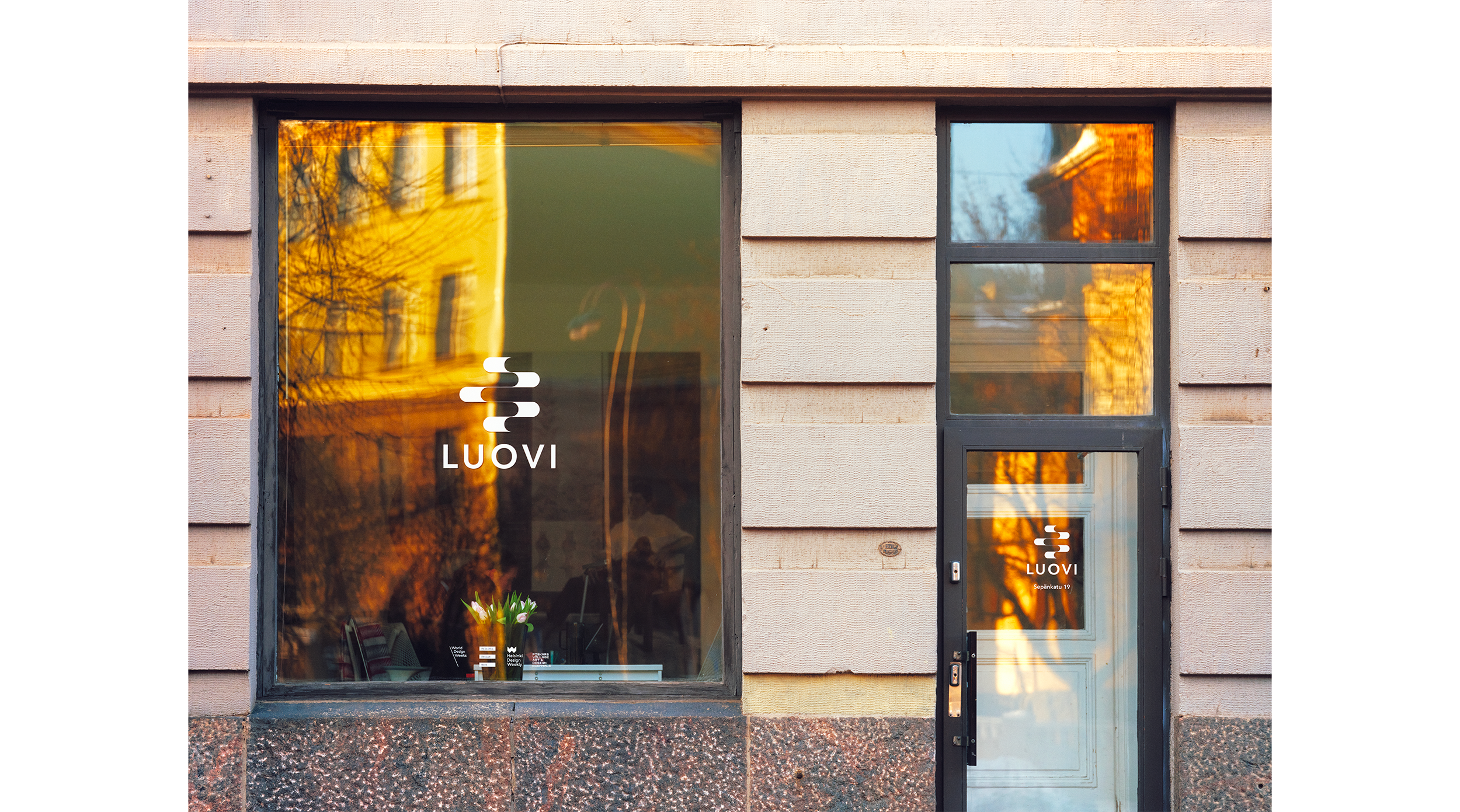
The undulating symbol and its animation depict sailing close-hauled in varying conditions. We leave a wake behind us, which gradually merges into the shared open sea.
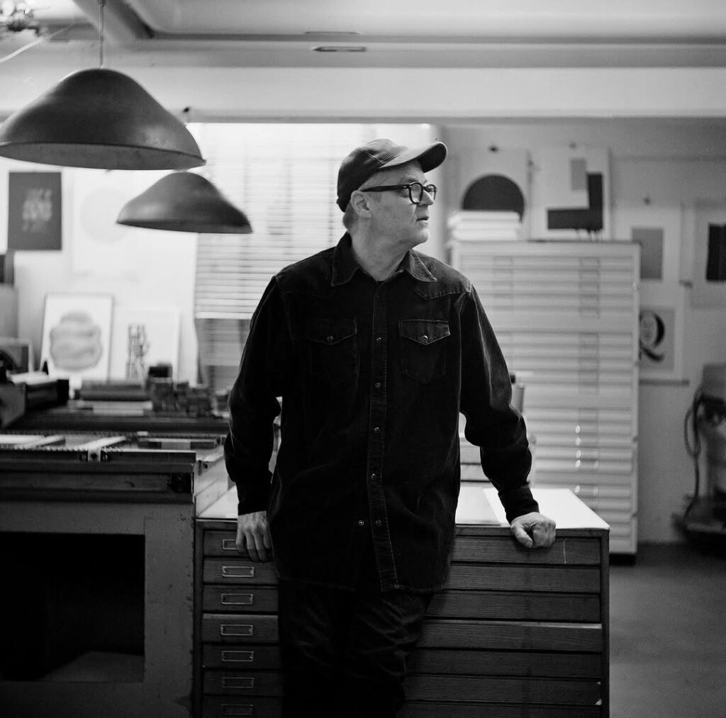
Ilkka Kärkkäinen is one of Finland’s most respected graphic designers. In recent years, he has focused on making graphic art at the Vallila Artists’ House, at the @so_helsinki studio. After decades of working in advertising agencies, Kärkkäinen has arrived at a more considered, slower, and more sustainable way of working. His core clientele consists of actors in the fields of design, architecture, and art who share the same values.
We spoke with Ilkka about the origins of the new visual identity.
“Luovi’s story is strong, and it feels like we succeeded in capturing it in the new visual identity as well. The name Luovi already carries its own meaning, and now we have a symbol that supports those meanings and values. I believe this will resonate for a long time to come,”
-Ilkka Kärkkäinen
“Kari and I have actually known each other for nearly thirty years. Our long collaboration and friendship made it easy to reach a shared understanding of what we’re after. From the very beginning, it felt clear that we wanted to tell Luovi’s story through an image, rather than relying solely on the currently mainstream name-based logo. By exploring different options, the symbol began to take shape as a combination of a wave-like image and a typographic element. The idea is that the same visual language can be applied across Luovi’s different sub-brands as well” Ilkka says.
There’s also an animated version of the symbol. The rhythm and speed of its undulating motion are carefully set to convey a timelessness and consistency, which are qualities that have always defined Luovi’s operations. The monochromatic simplicity of the image feels right in relation to the colourful loudness of the surrounding world.
“I like the organic nature of the symbol. Company logos are often quite angular and sharp, rushing upward and forward; what’s wonderful about Luovi’s symbol is its wave-like quality, its sense of gliding forward, the very idea of tacking. Even in the still image version, there is a distinct rhythm, built on strong contrasts. There are solid black elements and very thin lines, which create super-interesting contrasts,” Ilkka continues.
Ilkka describes how his way of working has, over the years, become increasingly timeless and restrained. When designing for commercial actors, one often rides the crests of trends, trying to latch onto colors and typographies that feel relevant in the very present moment.
“The more miles I have behind me, the more I notice my thinking becoming minimal. I try to focus on what’s essential, to have the patience to do something really simple. I try to design solutions that last as long as possible; I consider that as responsible design. The further an image can be reduced while still telling a story, the more likely it is that, also ten years from now, you can look at it and think: yes, this works.”
This same ethos of focusing on the essential runs deep in Luovi’s DNA as well. Instead of sudden rushes, the company has progressed at its own considerate pace and taken the time to develop its concept.
“Luovi’s story is strong, and it feels like we succeeded in capturing it in the new visual identity as well. The name Luovi already carries its own meaning, and now we have a symbol that supports those meanings and values. I believe this will resonate for a long time to come,” Ilkka concludes.
When talking about timelessness, it’s also worth asking what is particularly important in design at this moment in time.
“We’re living in a very confusing era right now! We’re surrounded by such chaos and turmoil, which feeds our need for safe harbors – this has actually always been important to me. I enjoy creating classical, long-lasting solutions, and the importance of sustainability is even more emphasized right now. You have to keep your feet firmly on the ground, think simple and clear, and act according to your own values. We can’t solve everything all at once, but we can make our own world a little clearer while everything around us is churning and splashing. This is also reflected in my design work.”
Please make sure to mark at least these Luovi events in your calendar:
Fiskars Village Art & Design Biennale, 7 June – 30 August 2026
Helsinki Design Week, 28 August – 6 September 2026