Form, motion and colour!
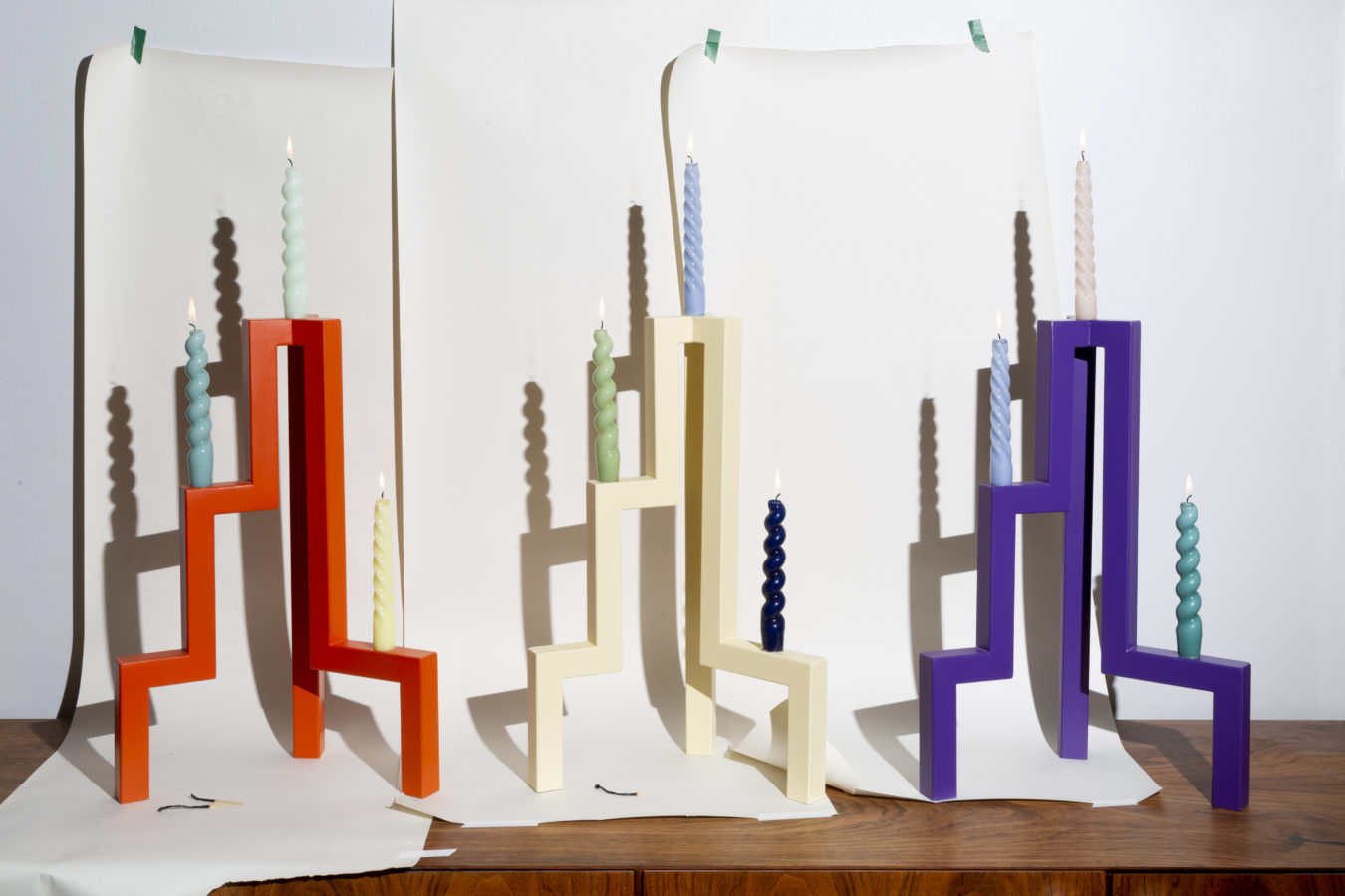
Looking at Finnish design from the outside, one’s attention is easily caught by the crude forms, the wood bent at will, and the squares, triangles and circles. Colours and large shapes. Patterns or asymmetry as if shaped with an ax or a pair of Fiskars scissors, far from Swedish Svensk Tenn or the elegant bourgeoisie salons of Central Europe.

Is our idiom shaped by our northern location, rough conditions and nature’s uncomplicated forms? Why must a frock look like a ball? What is motion in illustration? Is there a reference to nature in everything? Are the Finnish visual attributes weirdness and roughness? Why should we now be happy and colourful?


In a special episode at the Design Museum, Päivi Häikiö and Anni Korkman are joined by designer Hanna Anonen and artist Santtu Mustonen. Anonen is a designer, illustrator and spatial designer. She studied to become a carpenter in the Lahti Institute of Design and a designer at Aalto University. Her exhibition design has been featured in the Design Museum, for example, and her designs are being manufactured by Hakola and Made by Choice among others.

Mustonen has been active in New York and the Netherlands for a long time, creating for example installations, illustrations, objects and moving pictures. More recently, he has studied ceramics and glass as materials, as well as glass blowing and progressive glass design, getting to know its deepest essence from tree felling to mould making and material behavior.


Helsinki Design Weekly on Radio Helsinki on Thursdays at 12.00 and reruns on Saturdays at 9.00. Listen to the interview by tuning to frequency 89.7 MHz or as a podcast on the Radio Helsinki website, by using a podcast app or on Spotify. This programme is powered by Design Museum and Kämp Gallery.