Weekly Bubbling: Jaakko Suomalainen
The Weekly Bubbling series presents promising talents of the design world. They reveal us their idols who will be introduced next in the series.
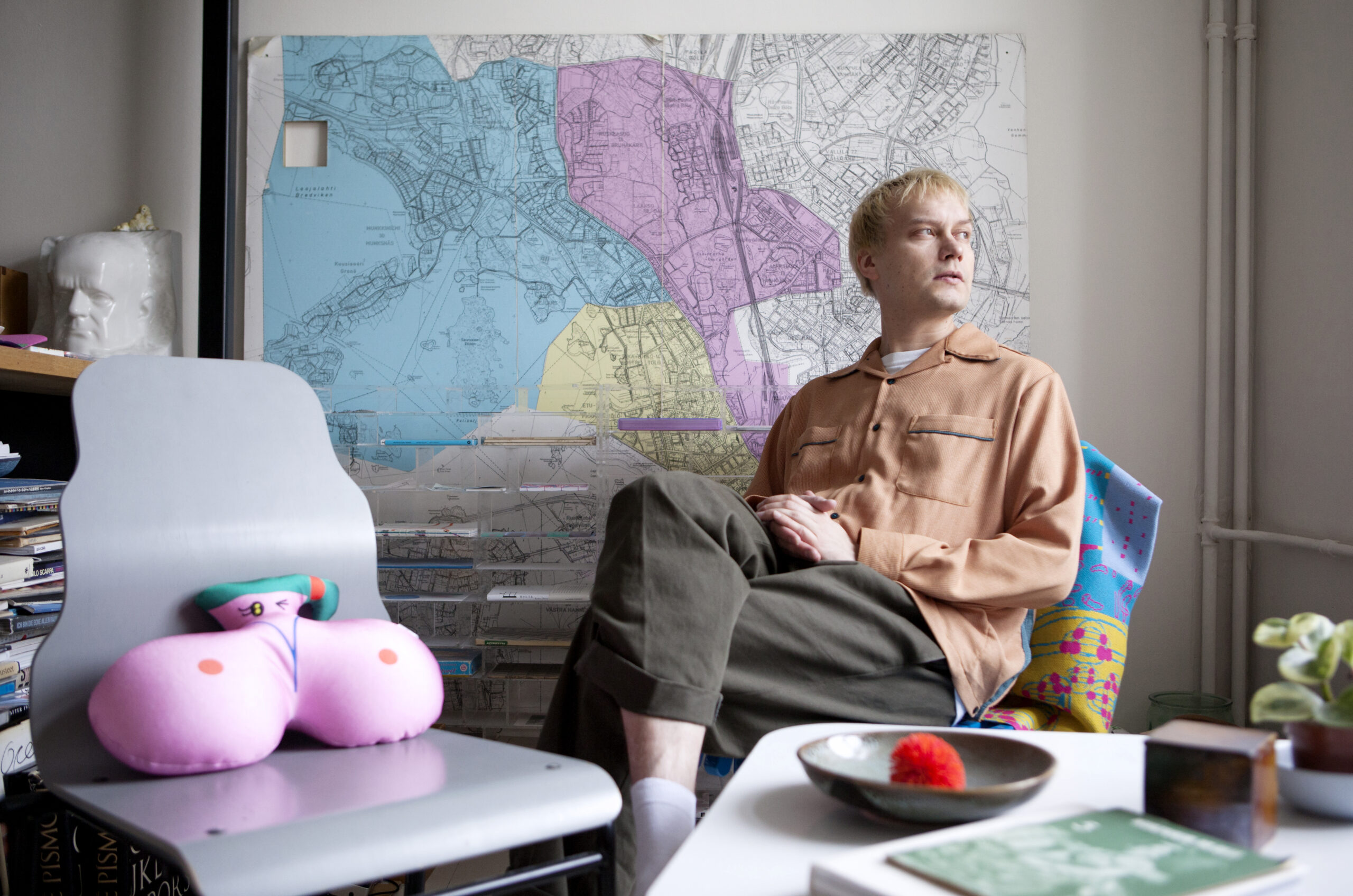
Graphic designer Jaakko Suomalainen prefers to talk about architecture instead of character spacing. Rich visual communications and differentiation are important to him.

How did you become a graphic designer and a type designer?
At first I produced my own independent journals. I interviewed punk and hardcore bands, wrote stories and did the layout. That inspired me to study at Borgå hantverks- och konstindustriskolan, a craft school in Porvoo, where I was taught by Christoffer Leka and Paula Jääskeläinen. I got interested in type design during my last year of studies when I went to explore the building and found a library that nobody ever told us about. I found some old Graphis magazines there. I consider myself a graphic designer who occasionally creates typography. I’ve always designed alphabetical characters as part of my graphic designs. I don’t go to many type design conventions and I don’t often discuss typography. I’m more interested in visuality in general than correct character spacing, for example.
What projects are you working on at the moment and where can we see them?
My day job is at Iittala, and I’ve worked with Photobooks from Finland and Photo Gallery Hippolyte. Little by little I’m starting to develop a visual identity for the Telling Tree art+rsrch project. You can quite often see my work in band posters and flyers on the streets of Helsinki. I created a typeface for the Kaiku Club together with Linda Linko. In addition to my day job and my projects, I design fonts at Helsinki Type Studio with Jungmyung Lee, Niklas Ekholm, Juho Hiilivirta and Eero Pitkänen.

What was the last thing that excited and inspired you?
Music, once again. Rockabilly, post-punk and old Finnish hardcore like Pyhäkoulu, Kaaos and Riistetyt. I’m not directly inspired by punk, but it must be operating in the back of my head. I like to mention copying, because in a way all design is copying. Often when I’m thinking to just do my own thing, I’m actually copying the most. One must be interested in the world. Reading in itself is inspiring. I’m a bit addicted to reading news in foreign media, and I’ve been interested in politics since primary school. I also read lots of Finnish and Swedish poetry.
What is the most important or interesting assignment you’ve worked on?
Marimekko was a fascinating place to work. The environment, the people and the history of the company were all cool. The most fun thing is to work with interesting people with whom I can relate, at least on a distant level, and find something peculiar. Clothes are a form of mobile architecture, and it was great to see how inspiringly Japanese people, for example, wear them. Regarding individual assignments, it’s been fun to explore with my friends’ diplomas knowing that there’ll only be a couple of copies seen by a few persons. There’s something fascinating in that. I’ve issued my creative ammunition to those.

In this series of articles, artist Man Yau said you’re able to express our time in a timeless way. What have you to say about that?
I feel that the more one focuses on a time, the more timeless the result can be. If you make an effort to create something timeless, you’ll end up with something mediocre and lame that nobody will notice. I believe many a designer, architect and artist have lived firmly connected to their own times. It’s important to me to combine unrelated matters and find my own angle there. I can mix fonts from different periods and accept a type of decadent thinking: to use gothic letters in a modernist layout, for example. One must allow the end result to be something completely different than expected. If you know the outcome in advance, what’s the point of doing the work.
What happened to regular grids and the ideal of clarity in graphic design?
Regular grids and loose layouts, they both flourish at the same time. The layout can be really regulated while mixed with something else. It’s easy to get lost if you go with just one ideal – next year you’ll probably need to change it. For a long time designers tried to do the lame look on purpose. The new idiom has been called – criticized or praised – the New Ugly, but you can label anything with that. It doesn’t mean anything as such. To me, rich visual communications and differentiation are important. Sometimes you can make a difference by using Arial “rationally” or “super-normally”. But if everyone does the same, it’s not a way to stand out anymore.
Do you have any idols?
I return to certain works as if by coincidence. Perhaps the most important designers to me regarding messaging are P. Scott Makela and Laurie Haycock-Makela. They created typographies to Scream, a video by Michael and Janet Jackson. Their work has been trendy and popular despite being very abstruse. Some of my Japanese idols, such as Issay Kitagawa, I’ve met in person. I’ve been to Japan four times during a couple of years. I don’t consider myself a Japanophile but I do like Japanese visuals.

Which is the finest typeface of all times?
František Štorm‘s Cobra. When you zoom into the letter g, it looks like a snake. When you zoom out, it looks like lower case. It’s brilliant. It was a joke, but the joke works.
If anything was possible, what would you like to do one day?
Perhaps I’d like to write better poems. It’s fun to type poems in very large print and using a font that has nothing to do with poetry.

Man Yau who was interviewed for this series earlier wanted to know your opinion about Helvetica.
Once I created a typeface by memory that I imagined would look like Arial, but it didn’t, not at all. It looked like my recollection of Arial. Helvetica is a collection typeface that may not have achieved everything it was designed for. Its black and white ratio is not in balance. Some Dutch fonts are much better. But it’s been nice to see Helvetica and Arial used in a cool way these days. Text may look a bit dry but large and neurotic. Neurotic rational realism.
Who do you admire and why?
I’ve been following textile designer Suvi Loviisa on Instagram. Her work encompasses many types of visuals, yet it’s very simple and interesting. Her items remind me of techno or IDM music. They involve something ethereal, nearly esoteric. They show the history of pattern design, and each pattern looks like an individual work of graphic art. On a timeline, we’re concurrently talking early 1900 and 2018. In my eyes, they clearly present an encounter of east and west, which is the most interesting thing about Finnish pattern design.

What would you like to ask Suvi?
Whether she prefers lakes or the sea.
What would you have liked to talk about in this interview?
Architecture, because I’m a fan. I like 20th century buildings and their spa- and ship-like facades. The kind you see in Vuosaari, or in the Radisson Blu Hotel in Kamppi. I could freeze my body into one of those. Some summer days they feature incredible colours, like Stella McCartney’s pinks of grays. The buildings in Ruoholahti and their red metal flags often remind me of an album cover by The Fall. I see certain brutalist architecture in music. When I heard Kraftwerk for the first time, I imagined the lamps that hang over streets in Helsinki.
