Weekly Pics: Tiina Latva
Weekly Pics is a peek into the visual diaries of designers and design professionals. Tiina Latva was initially a part of the branding team creating the identity for the City of Helsinki. Since then, she has joined the marketing unit in Helsinki’s communications department. Here she updates Weekly about the state of the new identity now.
My colleagues are my family of creatives. This family consists of the City of Helsinki’s teams and experts in graphic design and communications as well a wide group of freelancers and agencies working in design, marketing and service design, too. There are also printing houses, architects and photographers. And naturally the people of the city, who in a wonderful way have made the visual identity their own. In fact, we have received feedback from a Helsinkian who was upset when she saw the key brand element published at the wrong angle. We are indeed building the most interesting city brand together.
There is still a lot to fix and amplify. Whenever I get impatient, I remind myself that the City of Helsinki is the largest organization in Finland, and a visual identity is never a project but a process. We are only at the beginning. The changes in the world and in the tools we use are so rapid that we do not even expect the identity ever to be ready. What we do is just soar along and guide the teams towards new winds and directions.
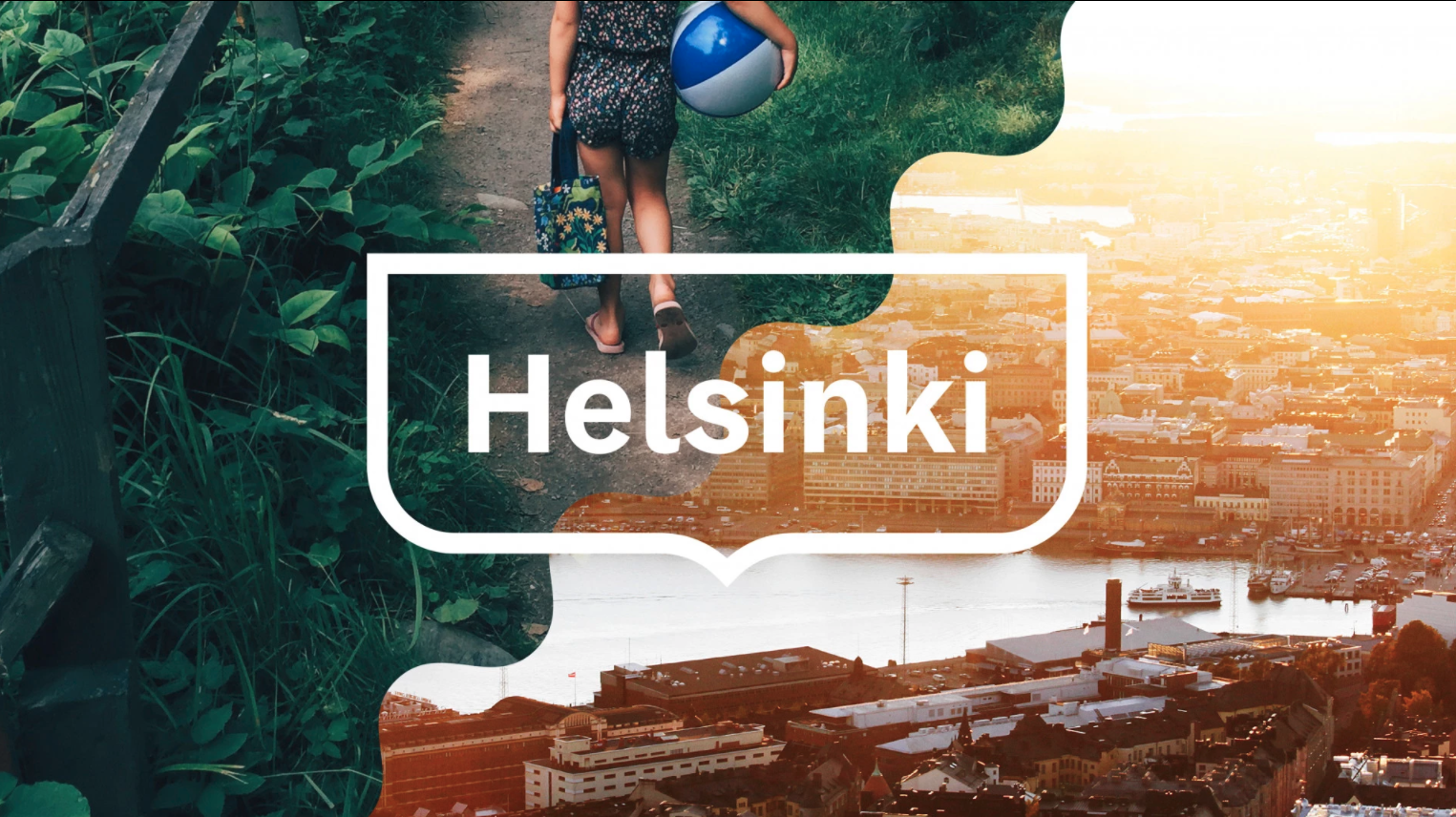
We did a survey regarding Helsinki’s frame logo last December. The survey, conducted by Miltton, informed us that the logo is already very well known among the people of Helsinki, especially young people. The logo also raises positive associations. In my work, this is very relevant. Using the branded logo and making use of the opportunities that the Helsinki identity offers in a creative way brings plenty of reliability and attractiveness to communications.

In today’s world, we are quite critical and not eager to wear visible brands. Last summer, the Helsinki canvas bag was seen more than the iconic Marimekko logo bags. It’s wonderful to see that Helsinkians want to wear the logo of their city.

I love seeing the use of the visual identity as a part of the urban environment. How do you recognize if a service is provided by the city of Helsinki – is the use of colour enough, or is the shape of the logo also required? We work consistently to stretch the boundaries of the graphic guidelines and harness our visual elements for functional use.

Last year, Helsinki was visible at the event Slush. My mental image of the event is of techy startup buzz and technological overload. This is why I’m grateful for the clarity and confidence that the city of Helsinki showed in the event. Helsinki is number one in the world in combining work and life.

When the new brand identity was launched three years ago, it was well received. In fact, there was a candy shop effect, and the elements and the colours were widely used. Getting a positive reception and new tools can be a source of inspiration to professionals. Now, after three years, there are more voices heard within the brand identity. We have stopped to think and made use of the creative concept and the idea in it. Previously, every project had its own identity. There was this need to differ from one another, from another colleague’s project or from the other department. Instead of differing, we are now focusing on how to be different from other cities and collaboratively benefit from meaningful actions. Through the use of a common visual identity, the city has opened up to its citizens in new ways. In fact, we’ve heard comments such as “I did not know before that this was a service provided by the city of Helsinki.”

The statue Manta is preparing to celebrate the first of May remotely, on Zoom. I find this to be a genius work by illustrator Sanna Mander. Should we make this a poster to be shared? The alignments of the illustration styles are a unified whole that are on our team’s table now. As a city, we need to ensure and give instructions that the illustrations will show people of different ages and backgrounds, the diversity of the whole city.

Creative agencies are used to criticism that the images look too good in their presentations. The usual custom is to use the best possible version of photos in the city’s marketing collection. This makes the customer think that the agencies are designing for a completely different audience than real-life users. Helsinki’s brand identity is designed to adapt to the needs of different industries. How nice are those invitation letters for first graders at the beginning of the school year? And how happy does the printed version of teaching and early childhood education plans look? The hierarchy and readability of the information has been carefully considered, yet they do not look like dry, official communication documents.

A visual identity is a different thing than a brand. Actions and the tone of those actions are what make a city. When creating an identity, we asked on a scale from 1 to 10 how brave an identity can be. The answer was 8 or 9. “The city wants to walk at the forefront of courage.” This sentence defined the mandate that we had in planning the identity. It was required to take the leap to something completely new. For me, the sentence today serves as a guiding guideline for my work more broadly. It works for me.