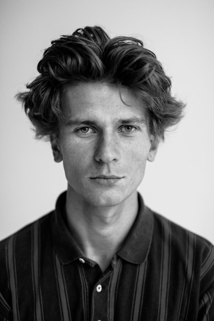
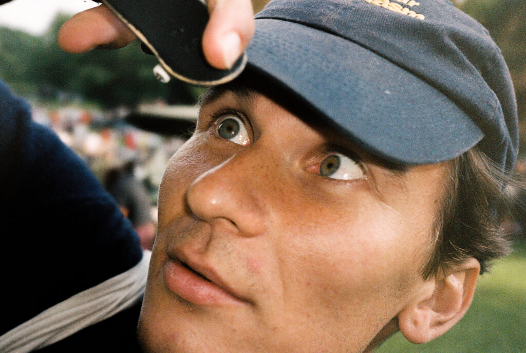
“If you don’t follow the rules, there is much more freedom,” says graphic designer Fredrik Karell
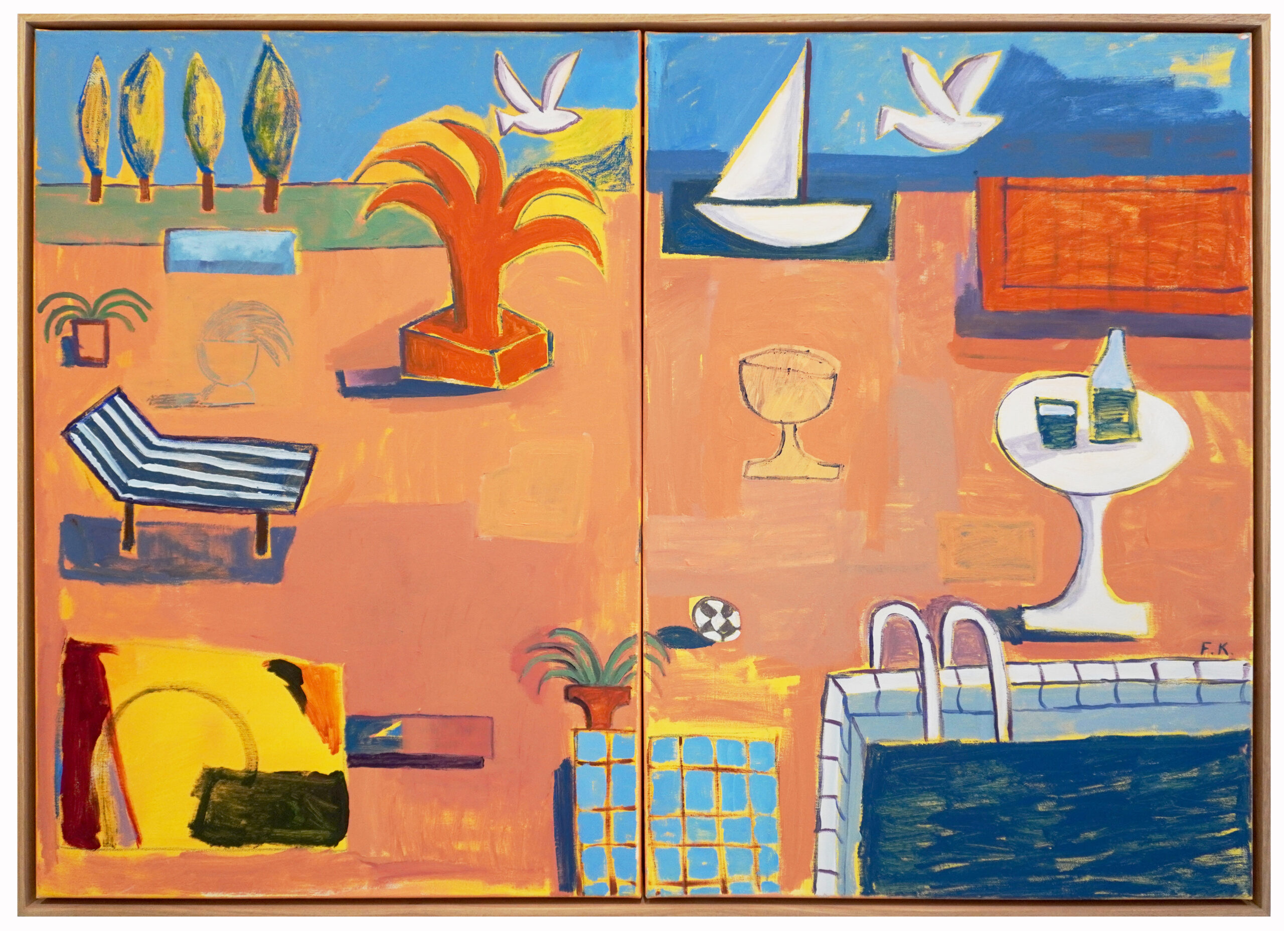
The visual identity of the 2023 HDW Collector’s Market was created by graphic designer Fredrik Karell. Karell’s passion projects are united by strong colours, intuition and playfulness. Above all, freedom can be seen and felt in them: the designer avoids the idea of what “should be done”.
Fredrik, at the moment your work can be spotted in several different places around Helsinki. How did you get to this point in your career?
Through many twists and turns. I have worked hard, been lucky and curious, failed, and taken advantage of opportunities. I have received support from friends, work communities and my social network.
When I was little, I wanted to be an architect, photographer or cartoonist. I’ve been drawing since I was little. My father was skilled at drawing, and our parents encouraged me and my sister to use creativity. I designed my first logos at a young age. I also founded the Cloything clothing company with my friend, which was also important for my career as a designer.
Currently I’m working as a freelance graphic designer for Red Bull. When I’m not designing visuals and implementing marketing materials there, I’m working on my own passion projects: drawing and painting. It is extremely important for me to reserve enough time to do this. Last summer was really busy because I was blessed with cool jobs that I couldn’t refuse.
Tell us about the projects you couldn’t refuse.
I created a visual identity for the Mini Playground pop-up event, which was held at the Common concept store at Viiskulma. They were selling small objects that had been curated from around the Nordic countries. My work included the poster design, stickers and all of the visual materials for social media updates. Behind the project was Helsinki Playground by Adam Tickle. His taste and aesthetics are very much in line with mine.
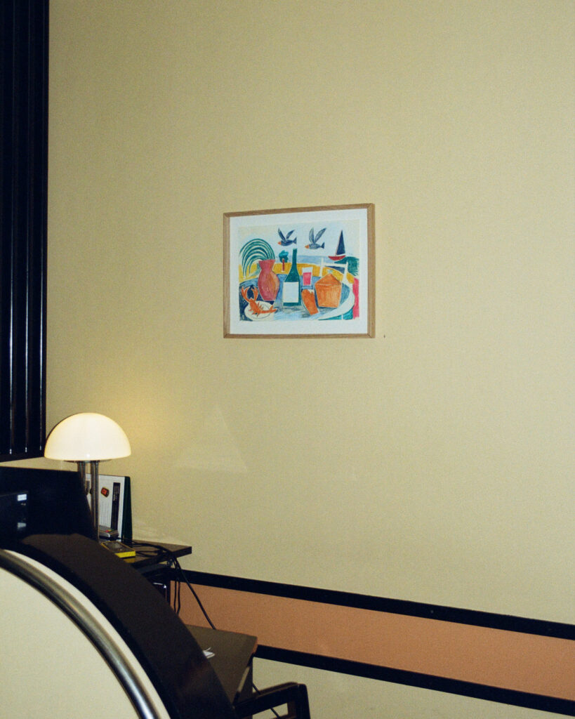
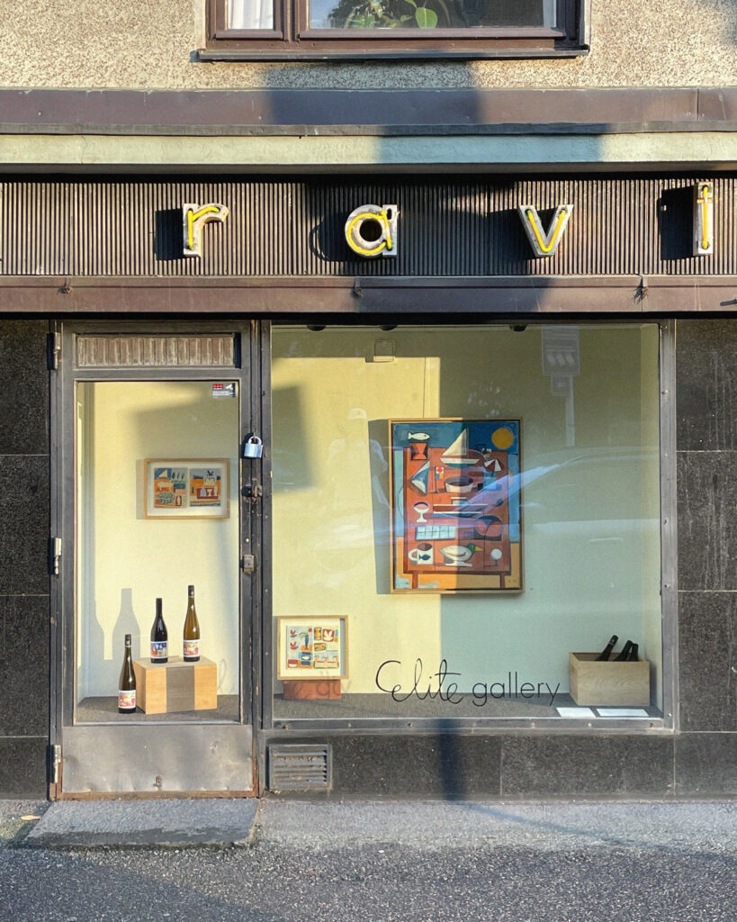
I also couldn’t refuse the opportunity to design a label for restaurant Elite’s Pinot Gris and Pinot Noir wines. I’ve dreamed of designing a wine label ever since I realized that there is someone behind their design. In addition, I held an art exhibition of ten works in the restaurant from the end of August to the end of September. Elite was a wonderful partner: it’s a legendary place with a unique relationship with art.
I also designed the poster for the skating event “Koffin vauhtikisat” held in Sinebrychoff park. It was a cool opportunity to show respect to the skate culture and support this independently organized event.
Why exactly was the wine bottle label a dream job for you?
An etiquette label is an interesting format because it has endless possibilities. We wanted to bring out the nature of the wine through the label. We chose the wines together, and I got inspiration for designing the label through tasting the wines.
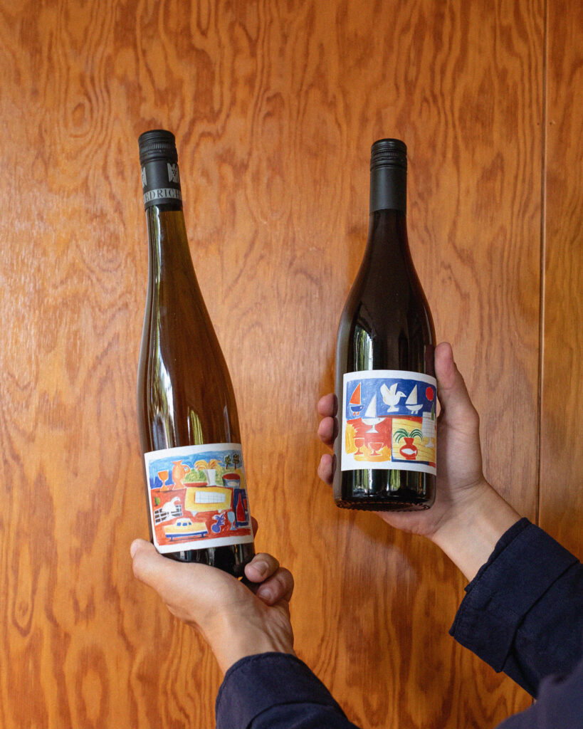
I value traditions and labels whose typography and illustrations honour the heritage of past eras. Nevertheless, I see an opportunity to create something memorable in the design of the label. Especially in natural wines, some really funky etiquette designs have started to appear. The labels have more and more colours, shapes and humorous illustrations.
For me, this dream project came at a good time: my way of working has had time to develop appropriately for a project like this. I’ve reached a point in which I dared to create a work of my own without thinking about how it fits in with other wines. I mean, wine is really its own and traditional world, which involves a lot of both appreciation and criticism, too.
How would you describe your illustration style?
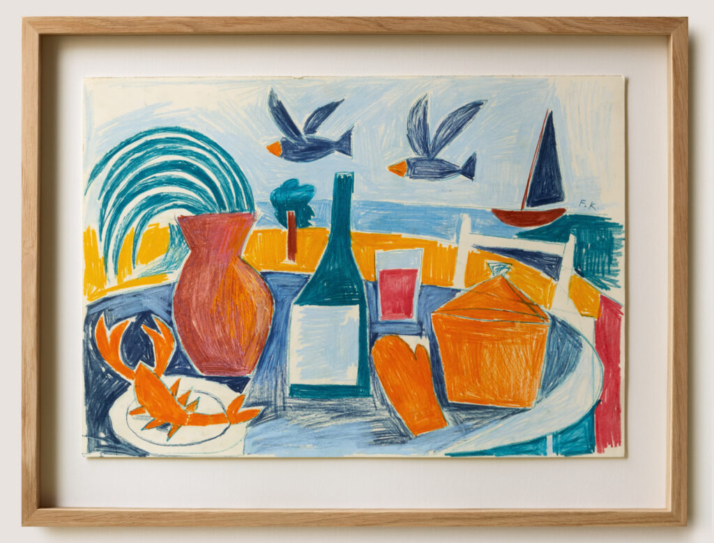
It’s hard for me to fully identify that my style is this and that. I often draw just for myself, and I test a lot of different things and shapes. I get a lot of influences from Fauvism, Naivism and folk art. The fascinating thing about all of these is that the art has been made in a different way than usual. Folk art, for example, was made by people who had no formal training in it. If you don’t follow the rules, there’s a lot more freedom. In certain cases, however, it is good to be aware of what rules are being broken.
Fauvism and naivism, on the other hand, appeal to playfulness and a certain strangeness. When Fauvism was born at the turn of the 20th century, the Fauvists were considered crazy and many of their works were, to put it bluntly, monstrous: they were so far from reality, and that was not what we were used to at the time.
It sounds like freedom is an important value for you, both in your work and in your working methods.
My education was graphic design, which also included drawing, illustration and painting. The teaching gave me good tools. However, art courses did not teach what is “right” or what is “wrong”. It encouraged me to do my own thing.
I try not to think too much about what I’m doing. I completely trust the process. While creating one painting, I might make ten or a hundred mistakes, which I have to fix along the way. I try to see mistakes as something that can create interesting shapes or colour combinations and eventually turn into really valuable elements.
Fredrik Karell
For example, at the restaurant Elite’s exhibition, I didn’t think much about how my works fit into the milieu – I painted and drew exactly what felt right at the time. My hands were completely free.
Your works are unique and your style is recognizable. A few elements repeat in your work, right?
Yes! I repeat many shapes and colours. For example, birds, pots, gardens, sea and sky appear in several different works. I like to play with simple shapes and basics: for example, you can draw a bird in so many different ways. I try new things when I draw. For the following works, I pick the shapes, colours and other elements that worked in the previous ones. This way I can maintain a consistent line where the development feels organic.
You live in Helsinki, grew up in Suvisaaristo and studied in Lahti. In recent years, your work has been seen specifically in the most iconic places in Helsinki. In 2019, for example, you made a poster for the Helsinki nightclub Post Bar as part of the Artist of the Month poster series.
I have met many interesting artists through Post Bar’s posters. They can have very different styles, but the posters have a uniform base which forms a whole. The concept really highlights makers that you might not come across otherwise.
In 2019, this was still a fairly new thing, and I definitely wanted to be a part of it. I was asked to make the poster for July. I’m a summer child myself, born in July, so it conveyed the Finnish summer quite strongly: sunset, sea and people on the terrace of the cottage. Earlier this year, an exhibition of all the bar’s posters was organized in this wonderful space above the restaurant Tanner, and there you could also draw your own poster. I probably sat for an hour drawing with a couple of other visitors.
This year, you collaborated with Helsinki Design Week for the first time. For example, you designed the visual appearance of the Collector’s Market at the Cable Factory.
This was one of those projects I mentioned earlier that I couldn’t turn down. Adam Tickle from Helsinki Playground connected me with Kari Korkman from HDW, and we sat together in the Maxill restaurant on Korkeavuorenkatu, thinking about what we could do. Kari is a big name who has done a lot for the Finnish design scene.
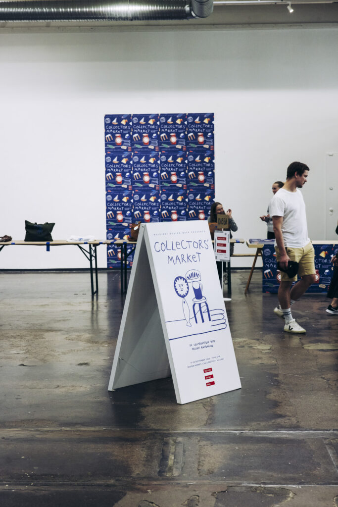
So we decided to design the visual look of the first ever Collector’s Market: the main visual design, the logo, a poster, the tape used to package items, marketing materials, a canvas bag and a t-shirt. The visual look tied the event together. The poster was inspired by an old Woodstock festival poster with a bird sitting on the hand of a figure playing a guitar.
Lauri Johansson, the designer who designed the architecture of the main exhibition, was also involved in the project. Together with him, we thought about the best way to take over the Cable Factory premises. It was important to figure out, for example, how to avoid making excess printed material. We didn’t want anything to go unused. I appreciate Lauri’s work very much.
What kind of design city is Helsinki?
Healthy, versatile and growing. There is a lot to see and feel here. This archipelago city has many beautiful buildings, museums, green parks, and events and activities related to culture and design. In addition, a new design and architecture museum is planned for Helsinki. Sometimes it feels like I simply don’t have time to experience everything!
Interest in design and culture is constantly growing. New innovations are developed here, and environmental challenges are taken seriously. Helsinki has a lot of extremely skilled creative people from different fields. It’s incredible considering how small a city we are in the big picture. That’s something to be proud of.
Having said that, there is also room for improvement. I’m a little worried about the decisions that are made in the city. Sometimes it feels like culture is being left at the feet of giant commercial projects. For example, in the Suvilahti project, customer understanding and joint planning, which should be at the centre of Helsinki city planning, have been completely forgotten.
It is important to develop Helsinki in a direction where there is room for creativity, culture and community. City dwellers need all of these. I hope this need is not forgotten because that could backfire in the future.
Fredrik Karell