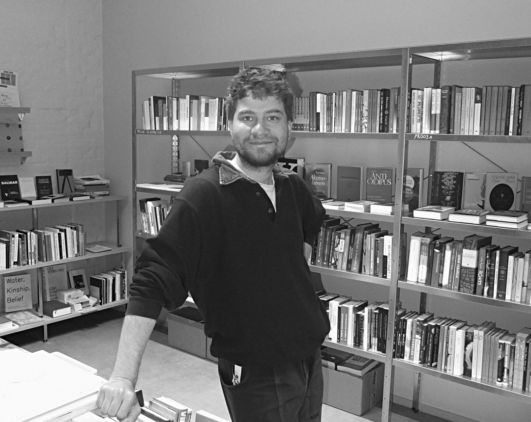
The anniversary-year identity for HDW was designed by book designer Samuli Saarinen
The Helsinki Design Week festival receives a new visual identity each year. This time, book designer Samuli Saarinen was invited to take on the task.
Hi Samuli, so do you mainly work as a book designer?
I describe myself as a book designer, because I try to manifest the kinds of work I want to do and know how to do. I don’t really make interactive or moving-image work at all. Of course, the tools are often the same across different kinds of commissions, but in my case, the focus is always on typography.
Do you design typefaces then?
I don’t design typefaces, but I work with typography. I probably don’t have the patience for the level of precision type design requires. That said, I still strive for a methodical approach. I try to work in a way that’s somewhat systematic. For each commission, I develop a working method that I try to stick with throughout the entire project. Of course, the process doesn’t always lead where I think it will – or should.
Tell us more.
As a graphic designer working on a computer, you have to invent some kind of framework for your process, because there isn’t always tangible material to work with. So for me, those constraints tend to be conceptual. Naturally, there are also technical specs, budgets, and so on, and those practical parameters are actually really important to my work.
Why have you specialized in designing text specifically?
When I started my Master’s studies at the Sandberg Instituut in Amsterdam, my aim was actually to broaden my practice beyond “standard” graphic design and typography. At the time, in the mid-2010s, critical design discourse was really active, and there was a strong trend towards interdisciplinarity, which also sought to problematize design itself. It was almost fashionable to abandon the traditional tools of craft. Designers wanted to deconstruct conventions or find something new in them. Many graphic designers began making films or videos, and I even considered expanding into sound art.
But then I had a kind of typographic awakening. I realised that what I’m truly interested in is the design of text – and, more than anything, text itself. I’m drawn to designing books because I’m drawn to books. I find it very difficult to orient myself in the stream of images that defines so much of visual culture today.
I’m drawn to designing books because I’m drawn to books.
I also enjoy working with books as physical objects. Some might describe this approach as fetishistic, because the book is a fairly anachronistic device in an age where we access information in entirely different ways. But I don’t mind if books are called fetish objects. I like to think of them as magical tools that accumulate meaning, facilitate experience and structure our sensory world.
Do you have any professional role models?
My role models are the older generation of freelance designers. I’m inspired by people who can keep working like this in this field all the way to retirement age. What interests me more than so-called “innovation” is long-term commitment, consistency and dedication. It’s impossible to say what it will mean to be a freelance graphic designer in 2045.
This year’s HDW theme is Celebration. Why is it important to celebrate design at a design festival?
Festivals like HDW give the creative community an opportunity to set its own goals – ones that aren’t necessarily commercial or dictated by clients. They give the field and its practitioners a space to define their own achievements. If that task is left to the rat race of the market, it will drain the whole field of meaning.
Festivals like HDW give the creative community an opportunity to set its own goals – ones that aren’t necessarily commercial or dictated by clients. They give the field and its practitioners a space to define their own achievements.
What do you mean by that?
I mean that our field can cultivate its own culture and establish its own value system through collective appreciation and enthusiasm. Design is rightfully criticised for gatekeeping and cliquishness. But it’s also essential that we collectively create meaning around our work – otherwise, it will be defined from the outside by market or state interests.
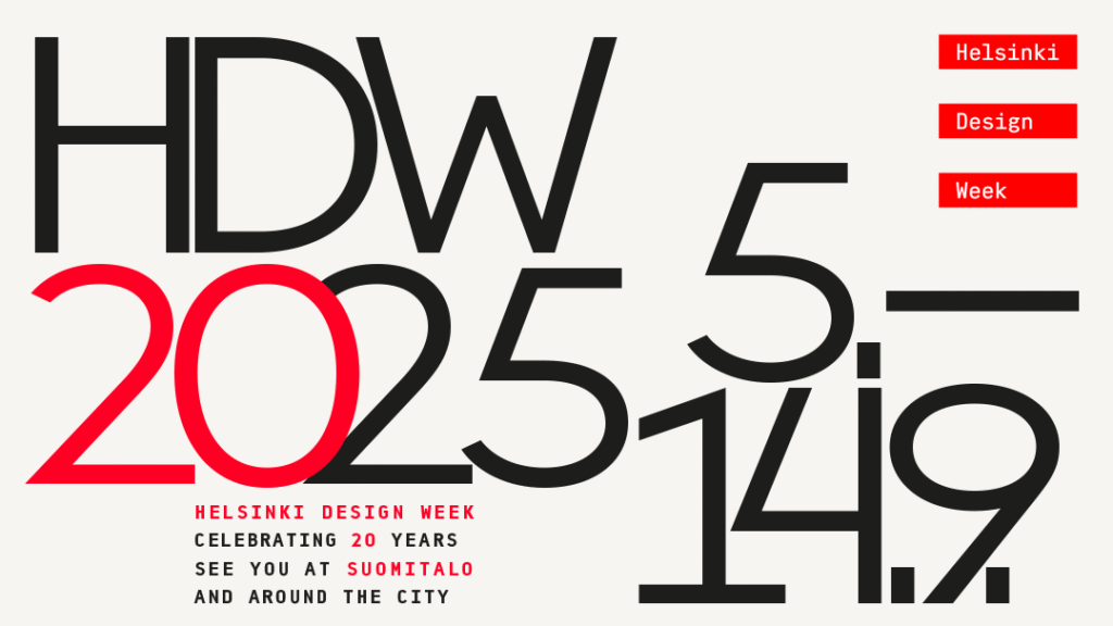
For its anniversary year, Helsinki Design Week has received a new annual visual identity, in which you made clever use of HDW’s existing brand identity, originally designed by Kokoro & Moi in 2015. Could you tell us more about that?
My aim was to “radicalise” the HDW identity, in the sense of going back to its roots – taking the raw visual elements of the HDW brand and using them as they are, but looking at them from a new angle and extracting new energy from them. The playful spacing and dense, irregular typographic texture highlight the form of individual characters, almost turning them into drawings. It’s a relatively simple approach, but it also acts as a kind of light “stress test” for the HDW identity.
Helsinki Design Week 5–14 September 2025. The annual visual identity is created in collaboration with Grafia, the Association of Visual Communication Designers in Finland.