Top visual trends in the book industry
Books are judged by their covers. The cover is a gate by which the reader enters the book: it needs to invite and provide a taste of the world inside. We visited the Nide bookstore to ask about the latest visual trends in the book industry.
Books are judged by their covers. The cover is a gate by which the reader enters the book: it needs to invite and provide a taste of the world inside. We visited the Nide bookstore to ask about the latest visual trends in the book industry.
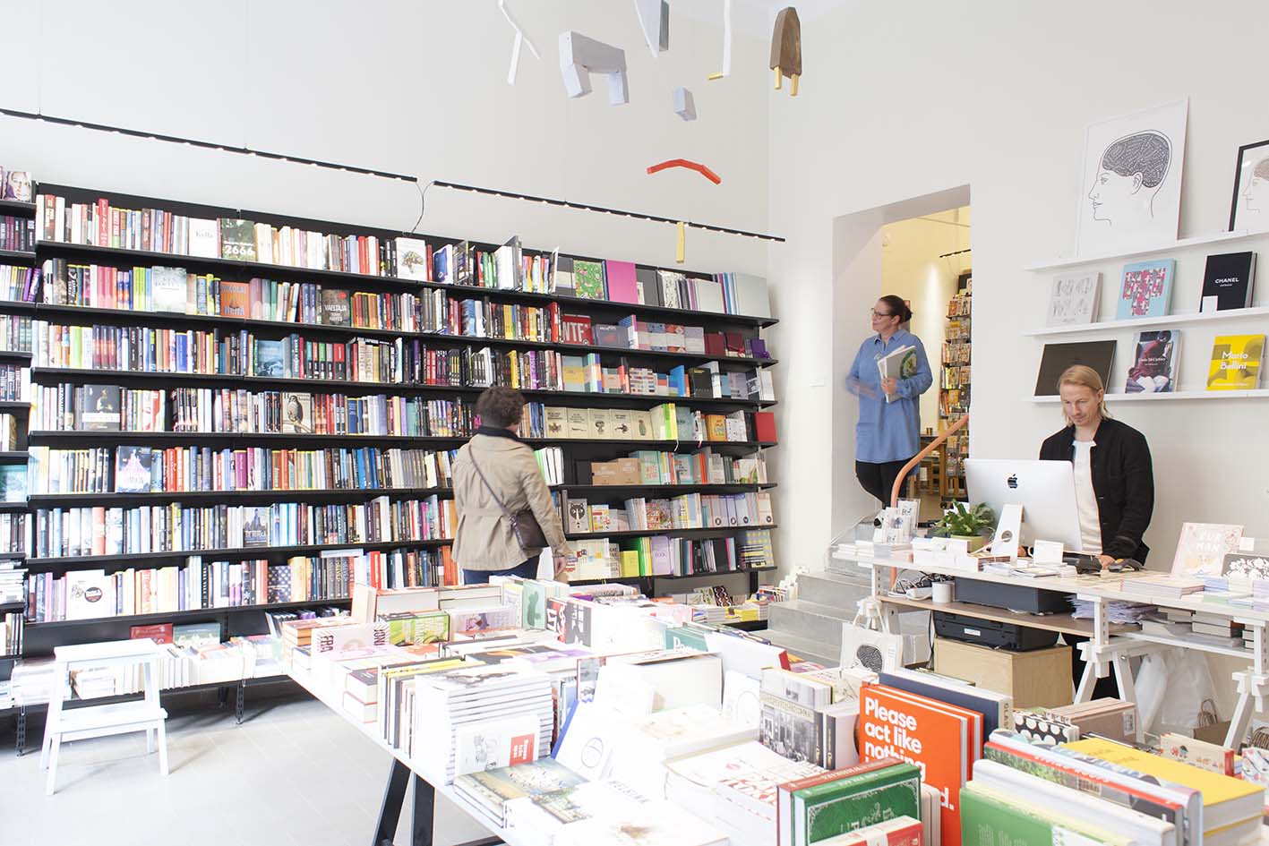
Nide located on Fredrikinkatu in Helsinki is a bookstore that carries carefully selected Finnish and translated literature, children’s books and art books. In addition, they feature art, culture and lifestyle magazines. At work, Nide owners Terhi Jääskeläinen and Joose Siira witness the industry trends as well as how books look and feel at the moment.
“The appearance of children’s books has been on international focus for quite some time, and now it’s starting to show in Finland, too,” says Terhi Jääskeläinen.
Many publishers use professional illustrators and graphic designers, but visual artists’ stampede to the industry is a phenomenon in this time. Jääskeläinen mentions Jenni Rope’s first work, a children’s book called Palle’s and Monko’s Peculiar Day. Rope’s book was published by Etana Editions, the visual style of which Jääskeläinen compliments profusely.

Children’s books are often colourful, but this is not a must to make the illustration work, says Jääskeläinen. In her opinion, a particularly beautiful example is Satu Kontinen’s purely blue-toned illustration to a Finnish non-fiction book for children and young adults. The book’s name Vesi – kirja maailman tärkeimmästä aineesta can be translated “Water – a Book about the Most Important Matter in the World” (author Laura Ertimo, not yet published in English).

The visual aspect clearly carries an important role in picture books, but it’s importance in fiction is increasing.
“The saying that you can’t judge a book by its cover is a bit outdated,” says Joose Siira. “Obviously a book is all about its content, but the value of good cover design is now better acknowledged for novels, too. If people post a photo of a cover next to their coffee on Instagram, you’ve done something right,” Siira laughs.
He says novel covers now feature interesting experiments with matte and gloss prints, types of paper and materials and graphic ideas. He is quick to choose a recent favourite:
“I really like Miki Liukkonen’s novel O. It’s cover was designed by Jussi Karjalainen. The cover encompasses a discreet beauty and promises brilliant content.”


What is Terhi Jääskeläinen’s choice for the most beautiful book this year? It is not a children’s book but one that functions as a work of art as such: Kaisa and Christoffer Leka’s album Imperfect. It consists of postcards that Kaisa Leka drew and wrote while the couple was biking across North America in the summer of 2016. The book has no cover, just a simple protective box, and you need to cut the pages open with a paperknife to be able to read it. Do not fear the unconventional format: if paperknife is not your sharpest tool, Nide staff can help you reveal the content.