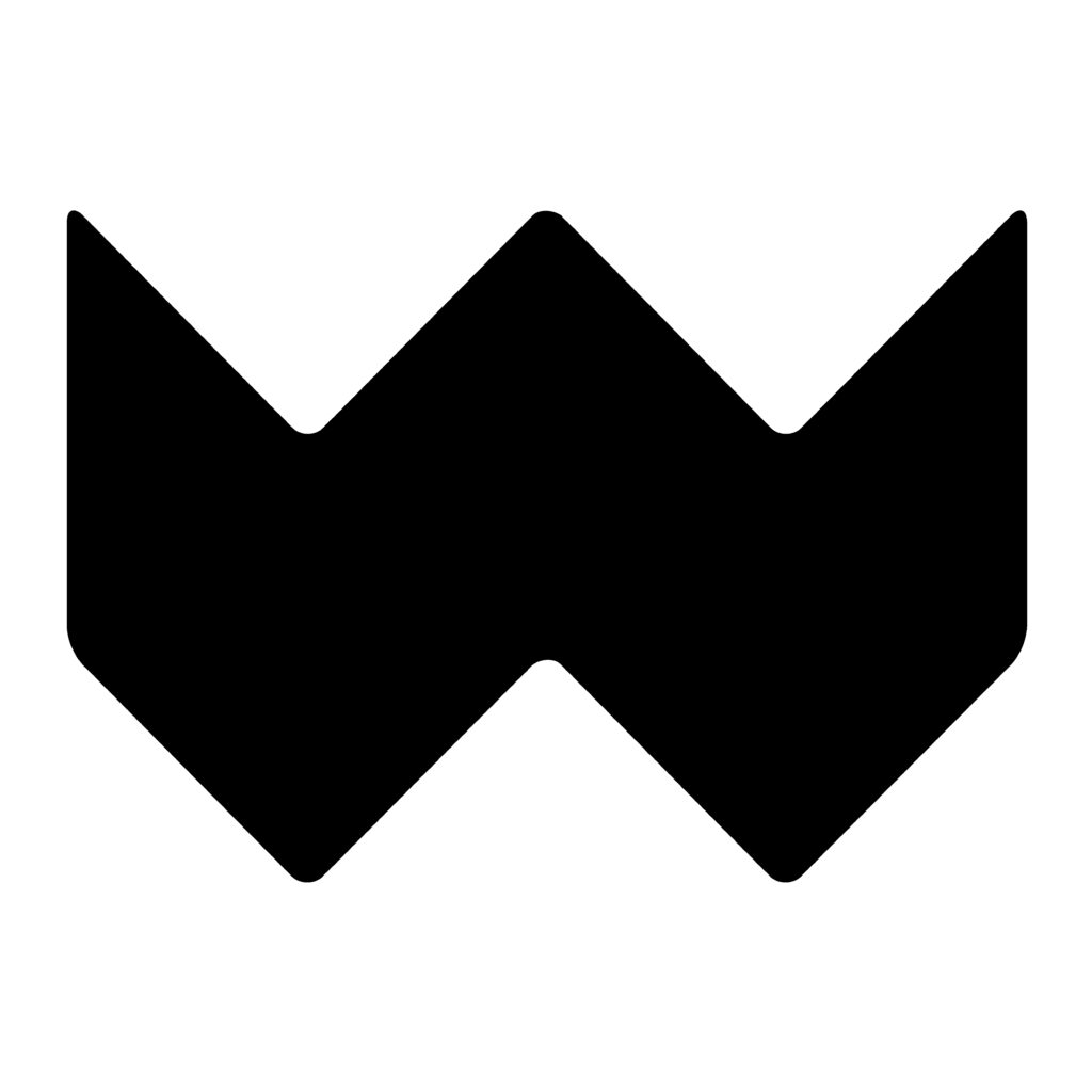
Weekly’s new logo is designed to last for decades
Helsinki Design Weekly is Finland’s leading independent design media. The bilingual, weekly newsletter and online media provide weekly phenomena, news and discussion on Design and Architecture. Considering the content, the media’s logo is important. The redesign of the website for Helsinki Design Week and Weekly offered the opportunity to create a more independent and recognizable logo for Weekly. Ilkka Kärkkäinen, one of Finland’s most award-winning graphic artists, was invited to be the designer.
“The basic idea was to design a figurative mark in addition to the name logo. It can be used to tell a story and open up content a little more than just a logo based on the name and typography,” Kärkkäinen tells Weekly. “I also wanted to open up the idea behind the acronym Weekly. The word ‘Weekly’ is strongly associated with the news media. The roots of the weekly news media date back to the 18th century and to the newspaper format, so you can see two open magazines in the letter W of the logo. The design language of the logo also communicates in a modern electronic format, with a stylized flash pattern.”
You have designed numerous logos, brand identities, books and posters. Do you have a design philosophy?
“My design philosophy is to formulate lasting, simple solutions. I think that is responsible and sustainable design. It would be great to see the Weekly logo still in use after decades. Graphic design involves living in time and mirroring the world around you. However, the logo must be clear and understandable, like an island in the midst of media noise, image and word flows.”
What kind of thoughts do you hope the new logo will evoke?
“Brand design is successful when people think ‘this is how it should be’. The sign must be a natural part of the world around it. The logo speaks the same language as the Weekly media and leaves a positive impression. As a designer, I’m used to all sorts of feedback as well as the fact that similar signs can be found all around. People always like to reminisce and think about where the design language of a new brand comes from. The basic elements of brand design are often square, ball and triangle. Of course, the results may evoke associations – no danger in that.
“A good logo lasts over time. A good logo supports the strategic goals of the company, community or brand and reflects its mission and vision. It meets the set goals, is clear and consistent, but also interesting and different from the competitors. A good logo brings insight: everyone finds something in it that adds value. It is important to me that the logo is as functional as possible. It should work whether big or small, in all channels and on all surfaces.”
Ilkka Kärkkäinen