Niklas Ekholm enjoys grounding type designing in the physical, material world
Helsinki Design Weekly’s Crystal Bennes meets Helsinki Type Studio’s Niklas Ekholm to discuss type design today, and his work on projects for everyone from Helsinki Design Weekly to the President of Finland and to MM6.
Let’s start with the old classic: how did you get into design?
I went from an arts high school to TaiK in 2007. It took me forever to graduate, because I started working quite quickly. I also took a detour to The Hague to study in the Royal Academy of Art where they have an MA in type design. I was on a BA exchange, but I lurked around the type department. Not long after that, I started working for Kokoro & Moi where I stayed for a long time.
We started Helsinki Type studio in 2010 with Juho Hiilivirta, Jaakko Suomalainen and Jungmyung Lee. Jungmyung moved to Holland to do an MA and ended up staying in Amsterdam and starting her own studio. We keep in touch, but don’t share so many projects anymore.
I worked at Kokoro & Moi for a long time, doing art direction and visual identities, with some type design. Juho and Jaakko also come from similar backgrounds, both working in different places as graphic designers while also working on type design separately. There’s not really a time I could point to where I started doing type design. I was always doodling letters back in elementary school. I certainly didn’t realise that it could be a job, but once I started studying graphic design and saw other people doing type design, I started to think that it could be.
Could you talk about the balance between type design and graphic design? I know HTS does a lot of custom fonts for clients and graphic designers.
That’s a symptom of all of us having separate design practices as graphic designers and then making custom fonts for clients through those projects. So far, our studio hasn’t really functioned as a type foundry as we have focused on client based projects. We do have about eight fonts in the shop that anyone can buy, but that will grow in the near future as I am now focusing more on publishing fonts as self-initiated projects. I think it’s nice to research properly and then really get into something where it might take three years to produce a font from idea to realisation.
And how does the research process work for a new type design?
There are two different answers depending on whether we are talking about a custom type for a client or whether a self-initiated project. Custom typeface projects are usually for a client with a comparatively short time schedule, within a month or two. This doesn’t leave so much time for exploration and you have to deliver what the client wants, so it is a specific kind of process.
I suppose the client’s expectations and brief gives you a jump start on research to a degree.
Yes, of course the needs of the client define the direction. Certain companies operate within specific genres of typefaces. If you look at tech companies, for example Airbnb and Uber, they have almost identical fonts. It’s difficult to make something unique within a space with so few parameters. You really have to focus on tiny variations within the genres.
Could you give a specific example?
The Helsinki Design Week fonts, which are also used in Weekly, are in that same larger space of geometric sans serif fonts. But they are on the periphery of that space as the type expresses something more wonky. It grounds itself in the design culture of Finnish modernism with geometric forms and with some minimal elements, but then the way it’s put together is more open and playful. There are some funny letters, the g is very exaggerated, for example.
And then how does the research process work with a self-initiated project?
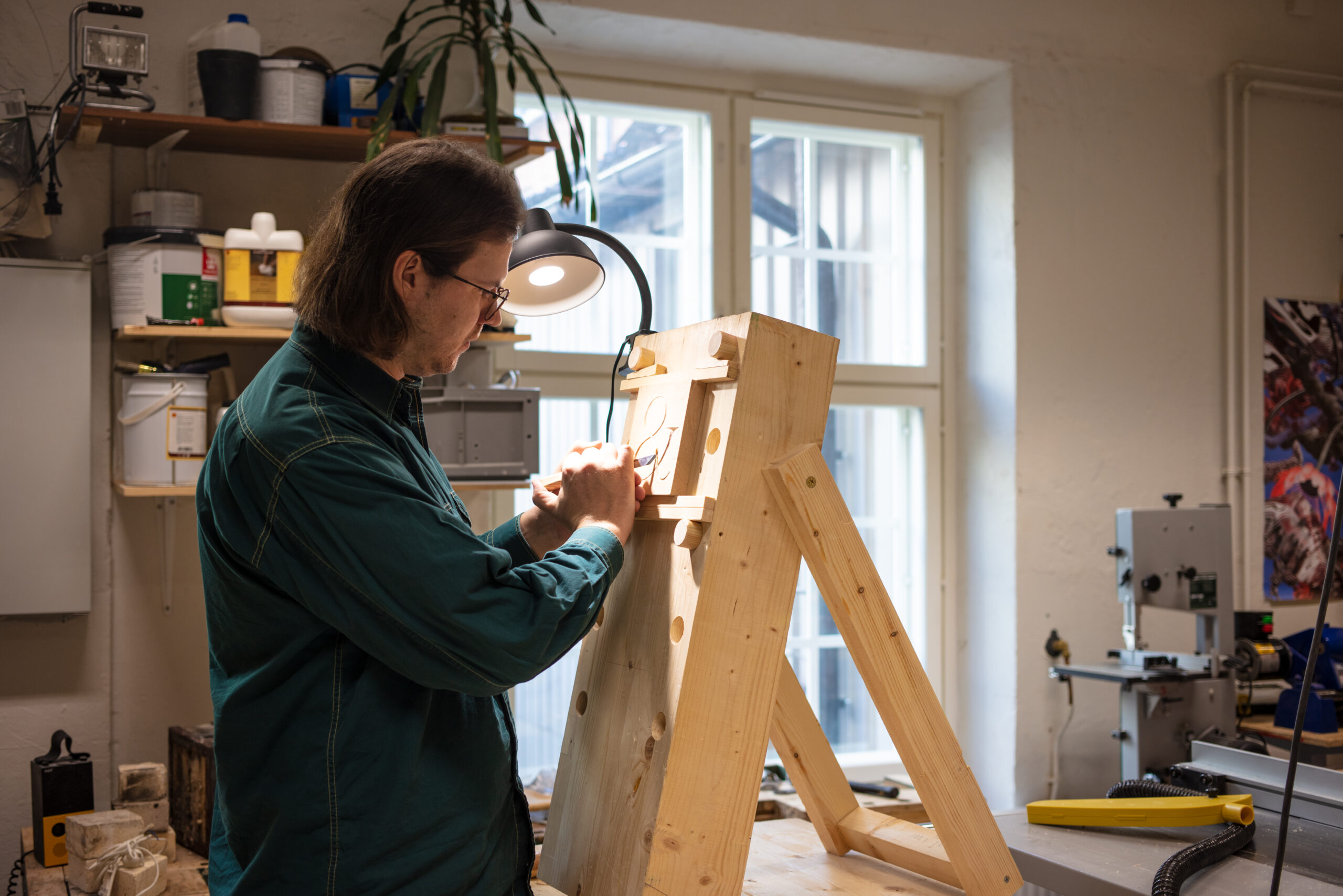
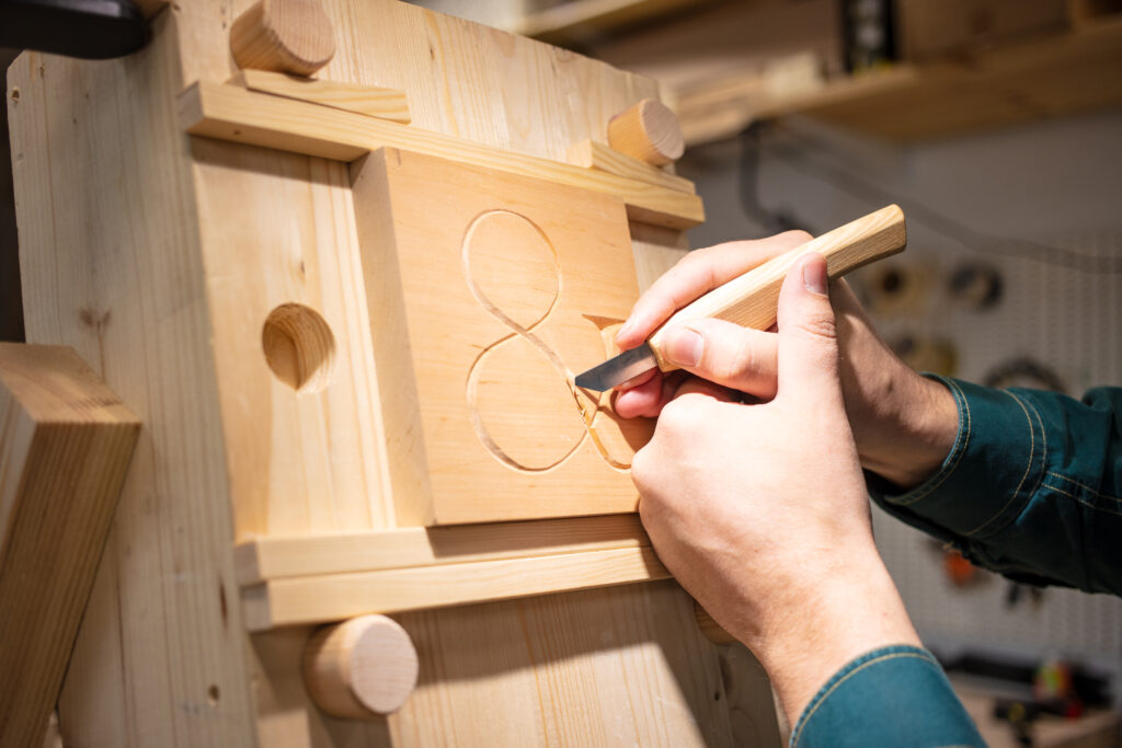
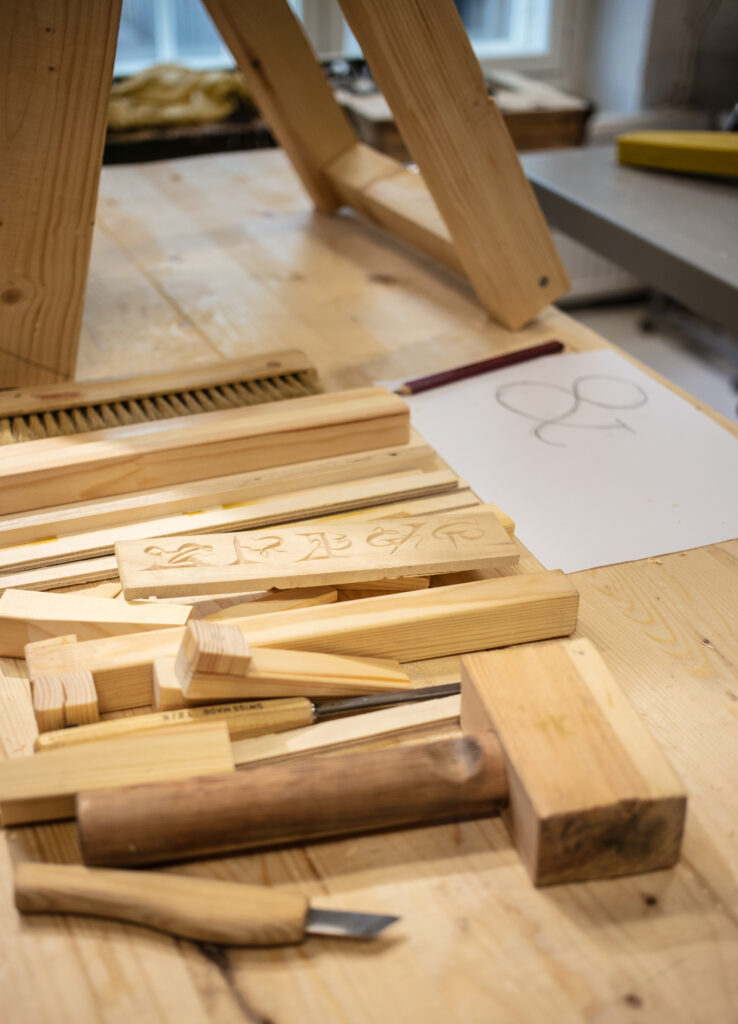
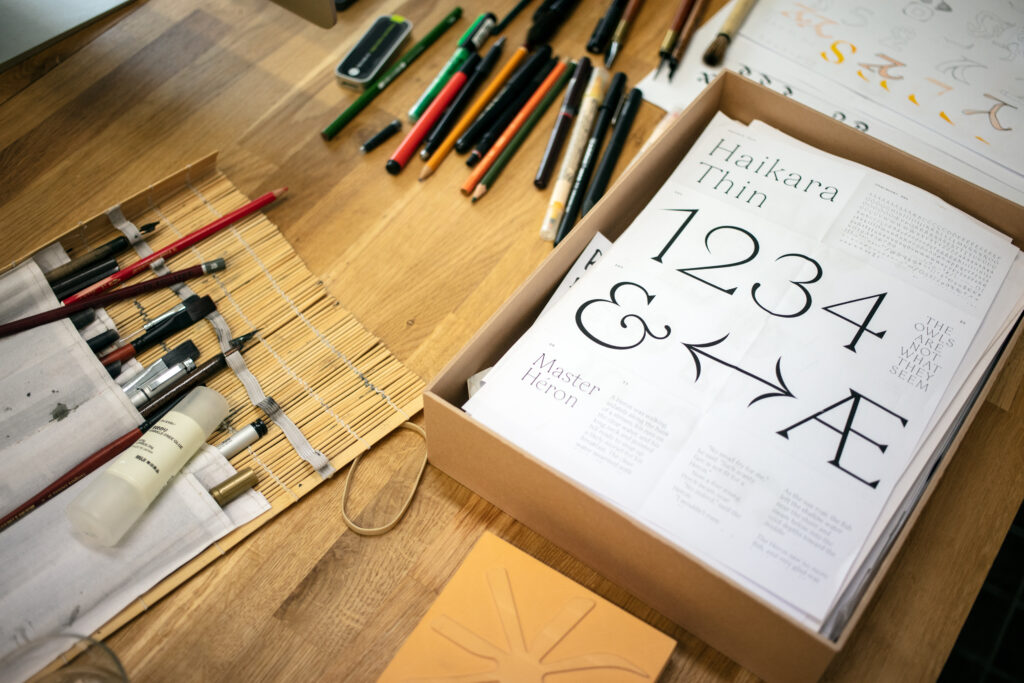
There are a million ways to get an idea for a type face. It could be a sketch or cut shapes from paper. Personally, I have been very interested in finding artistic combinations between tools and the body, so how the body’s movement with the tools makes certain forms in a specific way.
The first big typeface project I did resulted in the Bookish typeface. I just happened to visit The Päivälehti Museum, the media museum run by Helsingin Sanomat. They had old printing machines and all kinds of interesting equipment. I hadn’t really thought about the phase in typographic history between physical metal type, and the current digital type.
In between, there was this phase of phototypesetting which enabled a lot of different ways to use type. You could enlarge it hugely or distort the type with skewed fonts. But the detail that I picked up from looking at the machine was that it is an optical system. There is a lens which needs to be focused, the paper needs to be at a certain distance and the light shining through needs to be a certain intensity. So, the Bookish typeface plays with the idea of an error in this process, the idea that the type is out of focus, a bit blurry. The whole typeface design is based on a rounded quality.
I still haven’t fully realised the entire idea of going from too much to not enough light. I have sketches for additional versions that reproduce the thin, brittleness of not enough light or the blobiness of too much light. The whole project was a case of media archaeology, of finding a technology that isn’t much in use and then figuring out what makes the specific visual language of the technology in order to use it in type design.
From the sound of it, you aren’t motivated only by formal or aesthetic interests, but also archival or historical concerns?
Yes, very much so. Of course, the media archaeology approach is limited because not every old technology leads to a good font. The other archaeological approach is more like experimental archaeology, something I have been working on more recently. I experiment with different tools and materials to figure out how they work together.
The simplest example is brush and ink. You invent a certain choreography with your hand, playing with the shape of the brush to make modular lines from thick to thin. There is a workshop space in my current studio which is a good source of ideas. There’s a Japanese saw hanging up and I might look at it and think ‘how can I make type with that?’
It sounds like your starting point is always physical not digital?
Definitely, that’s something I strive towards more and more. Completely digital culture forms a loop and becomes self-referential very quickly. The world of digital fonts is very active and gives birth to wildly different styles, but I find that there’s something lacking in it. It’s like fantasy fiction without any realism, I really like grounding designs in the physical, material world. Maybe it’s more about personal preference because, as I get older, I try to get away from the computer as much as possible.
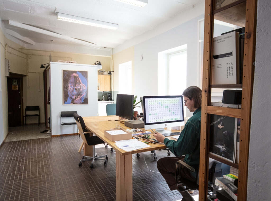
And how do you then translate the physical experiments to digital design?
It’s different for each project. Eventually it has to become a digital font and that format is based on vector curves drawn on a computer. Sometimes the final design is more closely based on the physical experiments. If it is a carving, I might rub it on paper and scan it. Similar to an ink splatter painting. I will scan it and make a vector drawing. But usually I like to try things out physically to get ideas and then reproduce them digitally from memory.
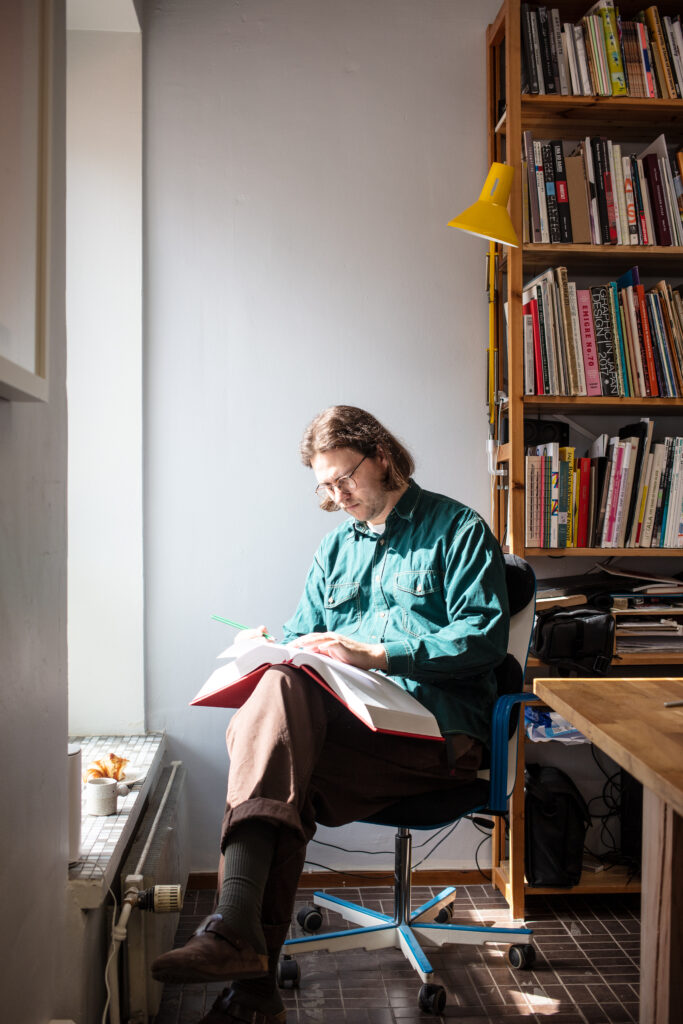
How long have you been in this studio?
I moved in the beginning of this year, so only about five and a half months. I used to have a studio space in the city centre, but here we’re in Sörnäinen which has more of these old industrial buildings around. There’s a design studio upstairs and nearby a book publisher, printmaker and metal workshop. It’s a really nice place full of a lot of good people.
Who do you talk to for advice?
Most of our projects in Helsinki Type Studio are still collaborative, so even though we don’t work in the same space, we all discuss the cultural contexts and share sketches and talk together. That virtual space is the main studio environment in a way. This physical environment is just a bonus.
I was watching an old interview that you did with Slanted talking about typography in Finland and the artificial idea that there is only one Finnish typographic style. Could you say a bit more about that.
In the interview you’re referring to, we were talking about the research we did when designing the Finlandica font. It was originally made for Business Finland, who promote Finnish exports, but it’s now used by many ministries. For this, we thought about where the Finnishness of Finnish typography comes from. We didn’t find a very strong native Finnish typographic culture, but instead a mix of influences from Sweden and Germany and Russian constructivist type.
What do you think about designing fonts specifically for the Finnish language? Do you start with K?
We do start with K sometimes. In the font we designed for the 100th anniversary of Finland in 2017, the K has a funny curved shape in one of the legs—an upward diagonal. In other languages, this might be inconsequential but in Finnish, because that letter comes up so often, it gives a lot of character to the type.
Finnish design has been quite successful at branding itself as something clearly defined, but I know many designers can find this restrictive. On the other hand, there are also certain elements which speak to people as quintessentially Finnish. I’m curious, especially since you work on fonts which are specifically connected to Finland as a country and its institutions, how that expectation of Finnishness expresses itself in type design.
I know what you mean about the idea of Finnishness, and it is something that we are trying to push a little. I don’t think that the best way to approach Finnishness is to find the most central theme. It’s more fruitful to go on a tangent and find out what’s on the periphery and look for lesser-known paths instead.
To give two examples of projects we’ve done together, for the book series Collection Kakkonen, Jaakko and I had a unique opportunity to delve into the Finnish tradition of glass and ceramics, which informed our choices of detailing for two distinct typefaces. One of the fonts highlighted the particular combination of roundness and rigidity so common in modernist glass, while the other emphasised the delicate human touch with a more calligraphic style.
A project with a completely different approach was the font we did with Juho for Institute Finlandais. Because the institute is a platform for cultural exchange, we focused on the idea of intertwining, which manifests as a twisting detail to the letter-forms, while the general typographic style is a blend between French and Finnish.
Another Finnish font that I worked on through Kokoro & Moi was for the President’s Office which, for obvious reasons, had to be very Finnish. The typeface was motivated purely by archival research, looking at what had previously been used and finding a way to make it work in a contemporary setting. It was almost like historical reenactment.
Anything else you’d like to add?
Given the studio focus, we talked a lot about the physical aspects, but in the type design studio practice, we mainly focus on cultural aspects. We’ve had a lot of work in the fashion industry recently. For example, a logotype for fashion designer Jenny Hytönen, and Jaakko has been working closely with Fashion Community Helsinki. More recently, there have also been larger projects which we can’t show many images from because of NDAs, projects for Off White and MM6. It’s really nice to work within fashion because the clients also work in a visually-intense field and it’s easy to have design-related conversations.
Another interesting project we’ve recently done was a typeface for the City of Oulu. Since Juho is based in Northern Finland, he has been aware that many fonts lack the characters to spell the Sami languages. With the Finlandica font, we made a point to include the Sami characters, especially since Finland has tried to Finlandise minorities. Now in the work for Oulu, they specifically asked us to include the Sami characters which they had seen from Finlandica.